Rollout in progress B2B · Enterprise SaaS ERP · Portal 3.0 Self-serve analytics

Helping seven business roles answer their own questions, without waiting on a report queue.

The data lived in the ERP. Access didn't. I led the design of Portal 3.0's reporting module, moving insight from request-driven static tables to a self-serve widget and dashboard builder that lets operators compose their own answers from live data.

Some data and figures altered to respect client confidentiality.

Product
ERP Portal 3.0
Reporting module
Role
Lead Product Designer
Builder · dashboards · migration
Team
1 BA
Design pair · eng squad · PM
Context
Restaurantware ERP
16,000+ SKUs · multi-warehouse
7
ROLE
AUDIENCES
12
CHART TYPES
PHASE 1
2
LEGACY SCREENS
MIGRATED
In rollout
PORTAL 3.0
2025 → 2026

Rollout in progress: adoption metrics not yet available.

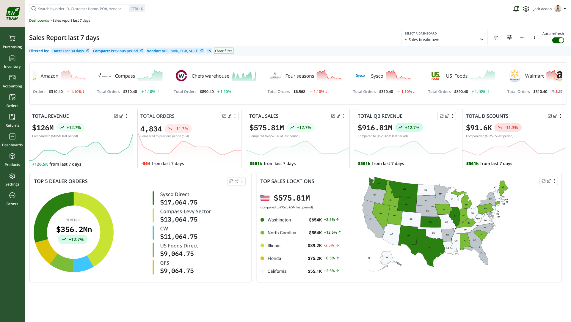
Role-based KPI dashboard with widgets and global date filter
What we built A self-serve analytics system that lets business roles land on relevant KPIs, filter by date, and compose dashboards, without filing a report request.
My role

What I owned, and what I didn't.

I was the design lead on the reporting module, widget builder, role-based dashboard system, composition behaviour, and migration of legacy KPI screens into Portal 3.0. The BA authored the BRD and owned requirements; I owned how the builder, role views, and dashboard lifecycle would feel in the product.

What I owned

  • Widget-builder interaction model, domain-gated guided sequence
  • Role-based dashboard system and default views per audience
  • Dashboard composition, drag, resize, global date filter
  • Migration of Sales Summary and Sales Breakdown into Portal 3.0
  • Design documentation, permission matrix translation, iteration rationale
  • AI widget builder concept (in validation): trust and verify patterns

What I did not own

  • BRD authoring and requirements ownership (BA)
  • Backend data layer, query performance, RBAC implementation
  • Engineering build and deployment
  • Compliance rule authoring (GDPR / SOC 2 policy)
01 · The Challenge

The data existed. Access to it didn't scale.

The design problem wasn't "add more charts." ERP 2.0 held orders, inventory, sales, accounting, finance, product, and purchasing data, but every non-standard question became a report request routed through the team. Operators waited or decided blind. I reframed the goal as self-serve access, not report production.

7
Business roles needing different slices of the same data
Not one shared dashboard
16k+
SKUs across multiple domains and warehouses
Questions outpace static screens
0
Custom widgets or dashboards in ERP 2.0
Static tables only
Queue
Every new question waited on the team
The real bottleneck
The gap · goal vs. reality

What operators needed

  • Answer a new question without filing a report request
  • Land on metrics relevant to their role by default
  • Compare periods, group data, export for reviews
  • Trust preserved from legacy Sales Summary / Breakdown screens
  • Insight in the same session as orders and inventory

What ERP 2.0 offered

  • Static tables filtered by date, no charts, no custom widgets
  • No period comparison, no role views, no dashboards
  • Non-standard questions routed through the report queue
  • Operators exporting tables to Excel for weekly reviews
  • Team building one-off views instead of designing the product forward
Where insight gets stuck
Request-driven · every new question repeats the same loop
Need an answer Report request Team builds view Wait in queue Static table
"Can I see top SKUs by margin this quarter?"

Not in the ERP. Unless someone else builds it for you. That loop doesn't scale at 16,000 SKUs.

This became the design brief: stop producing reports for people: build a system they compose themselves. Widgets they create, dashboards they arrange, role views that arrive already relevant.

02 · Discovery

Who needed what, and how they got it today.

Partnered discovery, not solo ethnography. Before opening Figma I worked with the BA to map role personas against the metrics each group actually acts on. I audited legacy KPI 2.0 screens, sat with engineering on Phase 1 data exposure, and traced how non-standard questions became report requests. Signals below are paraphrased from stakeholder sessions. Not verbatim quotes.

Role audiences · different slices of the same data

Accounting

Receivables, settlement, reconciliation. Not revenue mix.

Finance

Revenue mix, margin, P&L, cross-domain summary needs.

Product

SKU performance, returns, reviews, catalog-level decisions.

Purchasing

Stock levels, POs, supplier lead times, inventory-first.

CEO / Overview

Cross-domain summary, revenue, growth, risk at a glance.

Admin

Configures role visibility, who sees which dashboards and metrics.

How questions become answers today
1Static screenFixed KPI 2.0 table
2New questionNot in the screen
3Report requestRouted to team
4WaitQueue grows
5WorkaroundExport to Excel
Key insights

Same data, different slices

Every role needed a different answer from shared ERP data. Not one dashboard for everyone.

Legacy trust to preserve

Sales Summary and Sales Breakdown were the only KPI views used without workaround, their filters and defaults had to carry forward.

Queue was the bottleneck

Stakeholders didn't ask for more chart types first, they asked to stop waiting. Self-serve was the unmet need behind every feature request.

Phase 1 had to be honest

Engineering could expose Orders and Inventory first; Products and PO would follow. The builder had to work within that without feeling broken.

03 · Constraints

Hard boundaries from the BRD, and they shaped every design call.

Product & compliance

  • Inside Portal 3.0 shell, role-based access control enforced at backend
  • Migration without regression: legacy Sales Summary & Breakdown must carry forward
  • Mobile-responsive; every dashboard shows "last updated" stamp
  • GDPR and SOC 2 alignment for sensitive financial data

Technical & phase limits

  • Widget generation under 8 seconds (NFR-02), limits valid combinations
  • Phase 1 domains: Orders and Inventory only; Products and PO follow
  • Role permission matrix not finalized in BRD: design for configurability
  • Rollout staged, measured adoption data not yet available
04 · How the thinking evolved

From more reports to a system people compose themselves.

INITIAL FRAMING

Add more chart types to existing KPI screens, expand the fixed library the team already maintained.

SHIFTED FRAMING

Stop producing reports for people; build a system they compose: widgets they create, dashboards they arrange, role views that arrive already relevant.

BEFORE · REQUEST-DRIVEN Need an answer Report request Team builds view Wait in queue Static table AFTER · SELF-SERVE Compose widget + dashboard Live answer No request. No queue. No wait.
Reframe From a report queue to self-serve. The strategic shift that drove every downstream decision.
Rejected

Expand the fixed report library

Faster to ship incrementally, but doesn't scale, every new question still routes through the team and the queue stays.

Rejected

Embed third-party BI

Rejected on cost, data governance, and fit: operators needed insight in the same session as orders and inventory, not a separate login.

Chosen

Self-serve widget + dashboard builder

Moves access upstream to the user, scales across roles, stays inside Portal 3.0's permission model, at the cost of a far more complex interaction design problem. Prototype evidence in Section 07.

05 · System Design

Domain as gate, each step constrains the next.

I designed the builder as a guided sequence, not a free-form query tool. Domain → measures → dimensions → filters → visualisation → aggregate, each step constrains the next so invalid combinations can't be assembled. That was how I balanced configurability with usability for non-analysts.

Domain Measures · primary metric Dimensions Filters Visualisation · aggregate the gate · all below depends on it
Model Each step only offers valid choices, picking Orders vs Inventory filters everything downstream.
Decision

Progressive disclosure over one dense form

More clicks for power users; higher completion rate for the audiences this module is actually for.

Decision

Disable invalid options, don't error

Group-by and certain chart types simply don't appear when they don't apply, prevents failure instead of explaining it.

06 · Design Requirements

What the BRD required, translated into interaction rules.

Domain-scoped fields

Measures, dimensions, and chart types filtered by selected domain.

Primary metric drives chart

Multiple metrics selectable; one primary for visualisation, incompatible series never share a chart.

Group-by where it applies

Enabled for grouped bar, line, horizontal bar, disabled elsewhere, not errored.

Role-based defaults

Each role lands on ~8–10 metrics it acts on; admins configure visibility.

Global date filter

One range cascades to all widgets; last-7-days default on system dashboards.

Compose · save · export

Favourite, default landing, PNG export; duplicates scoped to their dashboard.

07 · The Final Experience

Build → Compose → Consume, decisions first, screens as evidence.

One lifecycle, three surfaces. I designed the product as create a widget, arrange it on a dashboard, then consume the right view for your role. Screens below appear only after the rationale for each step.

Select a step · rationale before screenshot

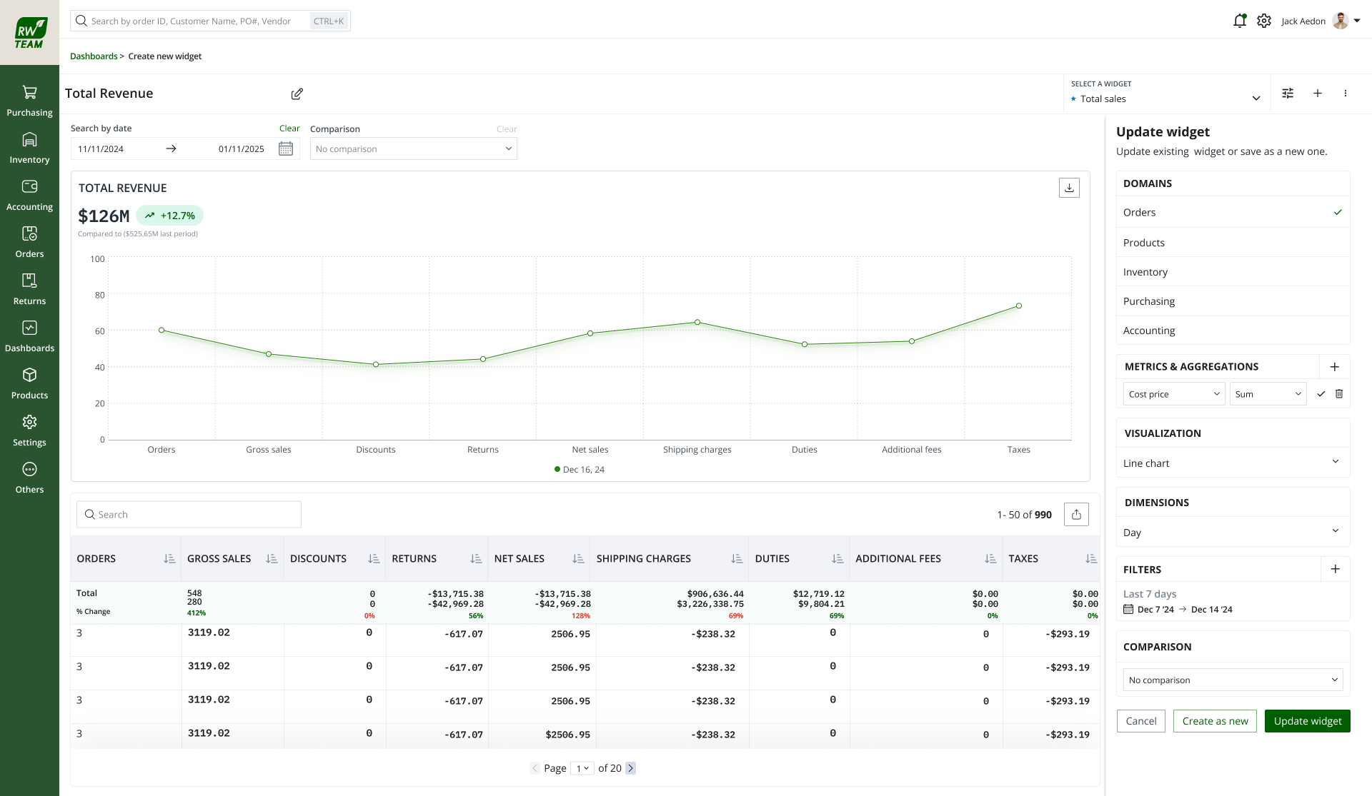
Step 1 · Build a widget

Domain gates everything downstream: invalid combinations can't be assembled.

User goal

Answer a specific question from live ERP data without filing a report request.

System response

Guided sequence: domain → measures → dimensions → filters → visualisation → aggregate. Invalid options hidden, not errored.

Design rationale

I chose progressive disclosure over one dense form, non-analysts complete the path; power users accept the extra clicks.

Expected outcome

A saved widget scoped to a dashboard, exportable as PNG, name capped at 50 characters.

Widget builder with domain through visualisation pickers
Evidence Operators could configure a valid widget without training, each step only offered combinations the data layer could serve.
Why this design

Information order: Domain first. The gate that filters every downstream field.
Trade-off: More steps than a single query box. I accepted that because error prevention mattered more than speed for this audience.

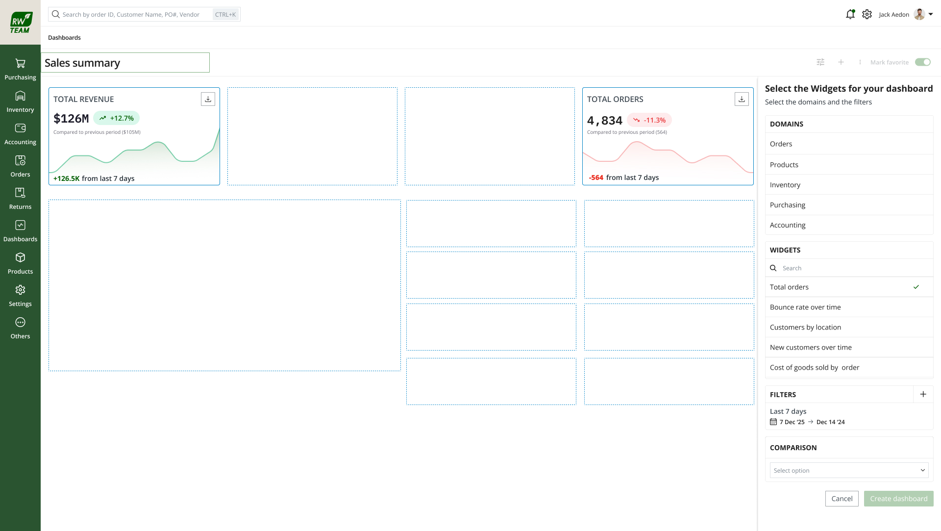
Step 2 · Compose a dashboard

Grid-constrained layout, readable on every device, not free-form chaos.

User goal

Arrange saved and pre-defined widgets into a view they'll return to weekly.

System response

Drag, drop, resize on grid; global date filter cascades; per-widget view, edit, export, remove.

Design rationale

I rejected free-form canvas, looks flexible in demos, breaks on mobile. Grid-constrained resize keeps proportions readable.

Expected outcome

A composable dashboard, favourite, set as default landing, duplicate widgets scoped to this board.

Composed dashboard with widgets on grid layout and date filter
Evidence Teams could assemble recurring review views once, replacing the weekly Excel export workaround.
Why this design

Layout: Grid lock-in over free drag, uneven gutters kill chart readability on tablet and mobile.
Trade-off: Less "canvas" flexibility. Production reliability beat demo flash.

Step 3 · Consume by role

The dashboard arrives already relevant, focus tool, not just security gate.

User goal

Land on the KPIs that match their responsibility: filter by date, drill when needed.

System response

Role-scoped default dashboards (~8–10 metrics); admin-configurable visibility; backend RBAC filters data per user.

Design rationale

I migrated legacy Sales Summary and Breakdown as system dashboards, preserved operator trust while the builder rolled out alongside.

Expected outcome

Self-serve insight in the same session as orders and inventory, no separate BI login, no report queue.

Role-based sales dashboard with widgets and global date filter
Evidence Each role landed on metrics it actually acts on, with a global date filter and last-updated stamp for trust.
Why this design

Defaults: Last-7-days on system dashboards, matches how operators already reviewed legacy screens.
Trade-off: One system, seven role views to configure. Admins need control; operators need relevance on arrival.

One data layer Orders · Inventory · Finance Accounting Finance Product Purchasing CEO / Overview
Model One system that adapts to who's asking: same data layer, role-scoped default views.
Permission matrix · from BRD
Capability Admin Accounting Finance Product Purchasing CEO
Create widget
Save dashboard
Download / export
Filters / sort
Group by
Expanded view
Favourite
Resize widgets
Metric domain Accounting Finance Product Purchasing CEO / Overall
Accounting metrics
Revenue metrics
Product metrics
Orders / inventory

Matrix structure follows the BRD; exact role permissions were marked "not finalized" in the source document.

Decision

Legacy screens as system dashboards

Re-skinned Sales Summary and Breakdown as read-only system dashboards, preserved operator trust while the builder rolled out alongside.

Decision

Grid-constrained resize

Free drag looks flexible in demos and breaks on mobile. Locking resize to the grid kept charts readable across devices.

08 · Validation

In rollout, measuring against the report queue, not vanity metrics.

Rollout in progress, no adoption percentages yet. Purchasing and Finance onboarded first (Phase 1 domain coverage). I'm measuring whether self-serve replaces the behaviours that created the queue, not widget counts for their own sake.

Baseline comparison

Report-request volume before vs after; time from question to answer (request → delivery vs build → view).

What we're measuring

Widgets created, dashboards saved, generation latency vs <8s NFR-02, Excel export workaround usage.

Early qualitative signal

Operators who exported tables to Excel for weekly reviews are building dashboards instead, anecdotal, not quantified.

Status

Measured adoption data not yet available. This section gets numbers when rollout produces them.

09 · Outcomes

What shipped, separated honestly.

Measured outcomes

Shipped · factual
12 chart types in Phase 1
7 role audiences supported
6 aggregate functions (Sum, Avg, Count, Max, Min, Unique)
2 legacy screens migrated (Sales Summary, Sales Breakdown)
2 Phase 1 domains (Orders, Inventory)
<8s widget generation target (NFR-02)

Qualitative outcomes

Observed · anecdotal
Operators building saved dashboards instead of weekly Excel exports: early signal, not quantified
Legacy screen migration preserved operator trust during rollout

Projected outcomes

In rollout
Reduced report-request queue volume as self-serve adoption grows
Faster time-to-insight for new questions (build → view vs request → delivery)
10 · Looking Back

One system that adapts, to who's asking.

What surprised me

How much trust lived in two legacy screens. Migration wasn't a nice-to-have, it was the adoption bridge for the whole module.

Wrong assumption

I initially overweighted chart variety. Discovery showed the queue. Not chart types, was the pain. Self-serve access was the real unmet need.

Would do differently

Start validation metrics earlier in rollout, even lightweight queue-volume tracking, instead of waiting for full adoption data.

When several roles need different answers from the same data, don't build several reports: build one system that adapts to who's asking.
Principle carried forward · ERP Portal 3.0
11 · In validation · AI widget builder

Describe the widget, verify before you save.

Validation in progress, no measured results yet. The manual builder is shipped; the AI layer collapses configuration to a sentence. I designed it to fill the same domain-gated structure. The user still owns the widget.

AI proposes; the operator verifies. Same trust pattern as HikeOn use cases: suggestion → visible config → accept, edit, or dismiss. Screens below show the validation prototype, rationale before evidence.

Select a step · describe → draft → verify → preview

Step 1 · Describe the answer

Plain language alongside the manual builder. Not a replacement.

User goal

Skip clicking through six builder steps when they already know what they want.

Design rationale

I kept manual path visible: trust grows when users know they're not locked in.

AI widget builder empty canvas with natural language input
EvidenceOperators could describe the insight they needed in plain language, without leaving the builder context.

Step 2 · Review the draft

Parsed configuration surfaced before apply. Not a black box.

System response

Maps request to domain, measures, dimensions, filters, visualisation: same structure manual builder enforces.

Design rationale

Ambiguity and confidence surfaced when parse isn't certain, false precision erodes trust faster than honest uncertainty.

AI widget builder detected configuration from natural language
EvidenceThe system showed what it understood before applying, so operators could catch misreads early.

Step 3 · Verify and edit

Editable fields. The visible config is the "why this?"

AI widget builder configuration fields populated in sidebar
EvidenceEvery drafted field remained editable, accept, edit, or dismiss before the widget was created.
Why this design

AI fills the same domain-gated guardrails, it can't produce an invalid widget because the manual builder's constraints apply to AI output too.

Step 4 · Preview before save

Chart and data table: same confirmation as manual flow.

AI widget builder chart preview and data table before save
EvidenceOperators saw chart and table before committing. The same verification moment as the guided builder.
In validation

What we're testing

Parse accuracy against real operator requests; trust and edit rate vs manual builder; time-to-widget. Sessions with Purchasing and Finance operators who already use the shipped builder.

In validation

Status

No measured results yet. This section gets numbers when sessions produce them, not before.