I lead the architecture, governance and tooling of the design system behind HikeOn's custom eCommerce ERP, built for a US foodservice and packaging brand with a 30,000-SKU catalog.
Before writing a token spec, I ran an audit. I catalogued every component in the product files, read the front-end code alongside them, and sat with engineers through a real handoff to see where intent got lost. Each finding became a goal I signed off with engineering.
| Finding | Goal |
|---|---|
| No canonical component | One source of truth that maps directly to Vue.js components. |
| Tokens defined twice | One token architecture, shared by Figma and code, for theming, dark mode, density and white-label brands. |
| Intent lost at handoff | The Figma component becomes the spec, so discrepancies surface before QA. |
| Invisible drift | Adoption and design debt measured every week. |
| Ungoverned contribution | A contribution model for designers outside the core team (section 05). |
| Accessibility (my addition) | WCAG 2.2 AA from day one. |
Audit & alignment
Token foundation
Primitives & first composites
Pipeline & handoff protocol
Governance & tooling
Weekly measurement
Library structure.
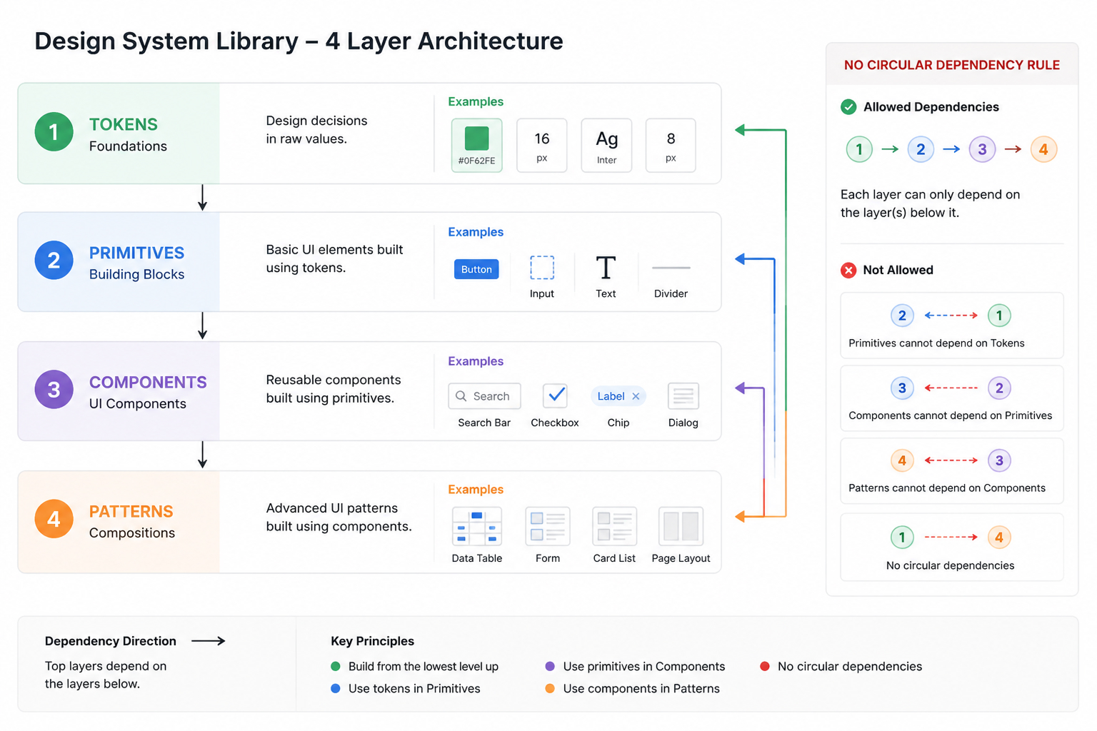
The system is four publishable Figma libraries. Each one depends only on the layer beneath it, so dependencies run in one direction and never sideways.
| Library | Holds |
|---|---|
| 01_Tokens | Colour, spacing, type, radius, elevation and motion variables. No components. |
| 02_Primitives | Icons, avatars, badges, dividers, base inputs. Consume tokens only. |
| 03_Components | Buttons, form fields, data tables, navigation, modals, charts, AI interaction patterns. |
| 04_Patterns | Empty states, error states, AI confidence states, copilot panels, multi-step forms. |
Token architecture.
The library graph controls what is allowed to depend on what. The token layers control how a value resolves. A brand change moves through the token layers without touching the library graph at all.
Tokens use three layers. Primitives hold raw values, semantic tokens describe intent, and component tokens map intent to a specific UI role.
| Layer | Example & rule |
|---|---|
| Primitive | Raw values in the Colors collection (Colors:Grey/Grey-1200, Colors:brand/color-brand-900-brand, Colors:white/Color-white-1000, Colors:Pallet/Pallet-01-default). Designers never reference these in components. |
| Semantic | TEXT/text-default → Grey/Grey-1200 (Light) / white/Color-white-100 (Dark) · BACKGROUND/bg-page-primary → white/Color-white-1000 (Light) / Grey/Grey-1200 (Dark). Describes intent. Resolves per mode. |
| Component | BUTTON/bg-button-primary → brand/color-brand-900-brand · ICON/icon-active → brand/color-brand-900-brand (Light) / brand/color-brand-1500 (Dark). Maps semantic intent to a specific UI role. |
Every colour pairing in the semantic set is pre-checked against WCAG 2.2 AA, with APCA for the borderline calls. A failing pair doesn't exist in the set, so a designer can't reach for one by accident.
Modes.
The semantic and component layers live in one collection, Global_combinations, which
resolves across Light and Dark. Component tokens alias semantic tokens, and semantic tokens alias each
other, so ICON/icon-success and BORDER/border-input-selected both resolve
through ICON/icon-active. The same collection exports to engineering as token JSON
consumed by the Vue.js build, so a mode switch in Figma and a mode switch in code use the same names.
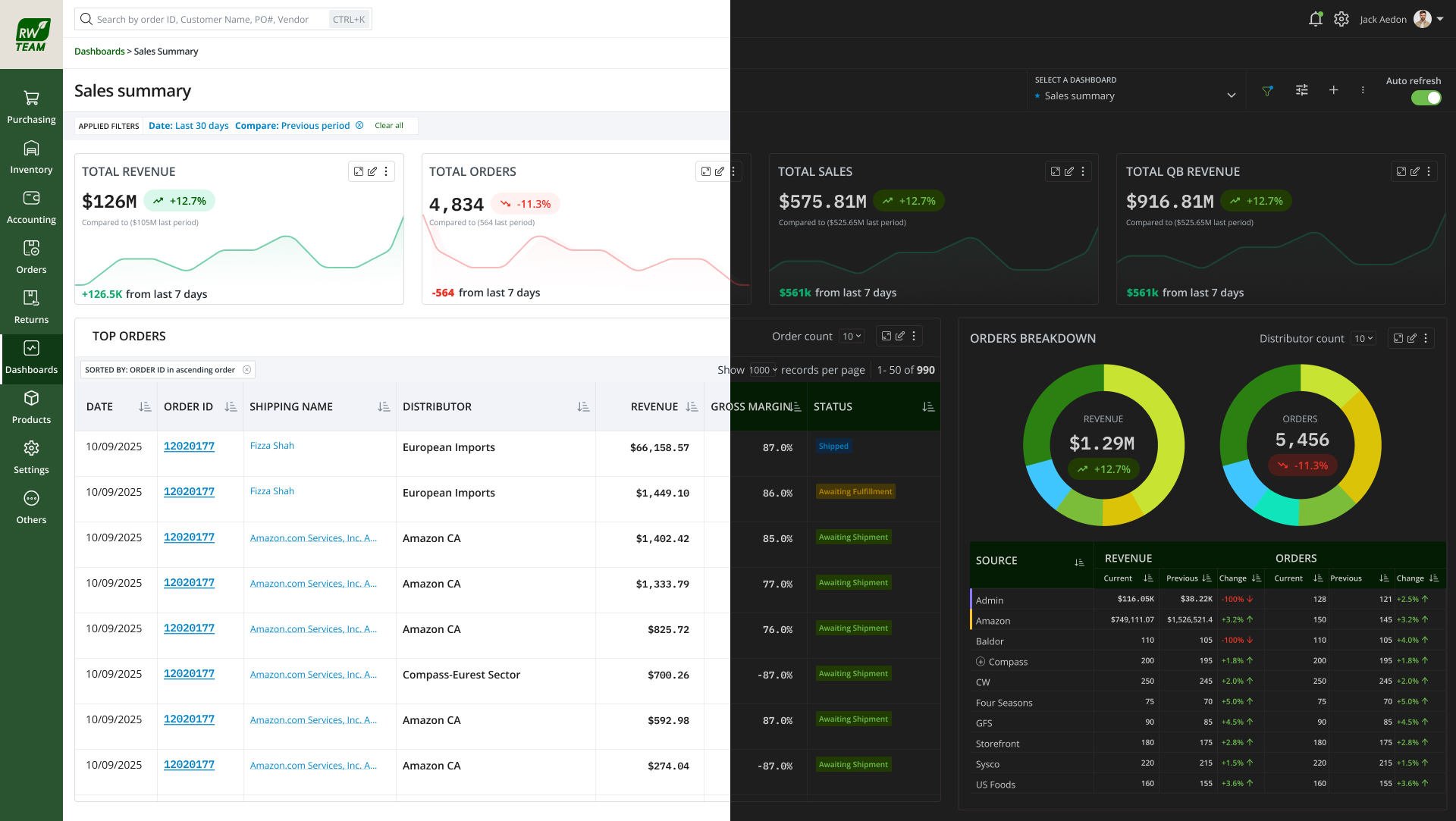
Here are six tokens from the charts palette with their real values straight from the
collection. One semantic name resolving to two tints:
Naming conventions.
Naming is the contract between design and code. It was locked on day one and hasn't changed since.
| Element | Rule |
|---|---|
| Tokens | GROUP / role-element-variant, grouped by intent (TEXT, BACKGROUND, BORDER, BUTTON, ICON, ALERT, Status), kebab-case roles. e.g. BUTTON/bg-button-primary, TEXT/text-placeholder-muted, BORDER/border-input-selected |
| Components | Pascal-case in Figma matches Pascal-case in Vue. Button / DataTable / FormField. Variant property names match on both sides. |
| Variants | Standard set across every component: Size · Variant · State · Density. Always in that order. No component invents a new axis without review. |
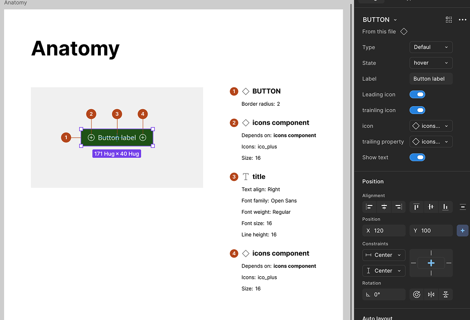
| Slots | Component properties named after Vue slots: leading, trailing, content. One-to-one map to engineering. |
| Figma | Vue.js |
|---|---|
| Component name | Vue SFC name. Button.fig → Button.vue |
| Component property | Vue prop with matching name and type. Variant=primary → variant: 'primary' |
| Boolean property | Vue boolean prop. Disabled=true → disabled: true |
| Slot property | Vue named slot. Leading → <slot name="leading" /> |
| Variable (token) | CSS custom property exported by Style Dictionary. color.bg.brand → --color-bg-brand |
| Variant matrix | Storybook story per variant combination, generated from the same matrix. |
Handoff protocol. Engineering reviews each component in Figma before build, using a fixed annotation block: purpose, props, states, accessibility, motion, do & don't. After build we diff it in dev mode against a checklist of states, and any mismatch is fixed at the component.
Built with Cursor and Claude Code.
Problem: Designers in different modules kept recreating near-duplicates, and finding them took days.
What it does: Clusters near-duplicate components by structure and meaning, with side-by-side diffs to consolidate them.
Problem: Detached instances, hardcoded colours, deprecated components and missing variants, none of it visible.
What it does: Audits files for all four and exports a triage report with file and frame references.
What we measure. Two numbers, read out in design review every week: adoption (screens built on system components versus detached or hand-rolled ones) and design debt from the Debt Collector. Flat or rising debt means the contribution model is leaking somewhere.
One loop, start to finish. When the report flags a cluster of detached instances, we trace it back, usually to a frame older than the canonical component or a contributor who didn't know it existed. We rebuild that module on the system component, and the next week's report shows the delta.
Governance model. ds-checklist-one.vercel.app ↗
| Role | Responsibility |
|---|---|
| System owner (me) | Roadmap, architecture, breaking changes, final review. |
| Core contributors | Two designers and one front-end engineer. Triage intake, build and review components, maintain documentation. |
| Product contributors | Any designer or engineer outside the core. Can propose and build, with required review steps. |
Quality gates. No component ships without passing all four:
Lock the token JSON export contract with engineering on day one. We retrofitted it later and paid a small migration cost.
Start the Design Debt Collector plugin earlier. By the time it shipped, we already had a backlog of debt to triage.
Invest in dev-mode-ready annotations from the first component. Going back to annotate is slower than annotating as you build.
Running the system as a living product, not a deliverable, is what keeps it healthy as the surface area grows.